 [social_warfare]
 Some brands are exposed to an audience all the time, some not so much.
Alcohol brands are almost always entirely visible. After all when your product pretty much looks exactly the same as all your competition, recognisable branding design is really the only way for your customers to differentiate you before they’ve had a sip.
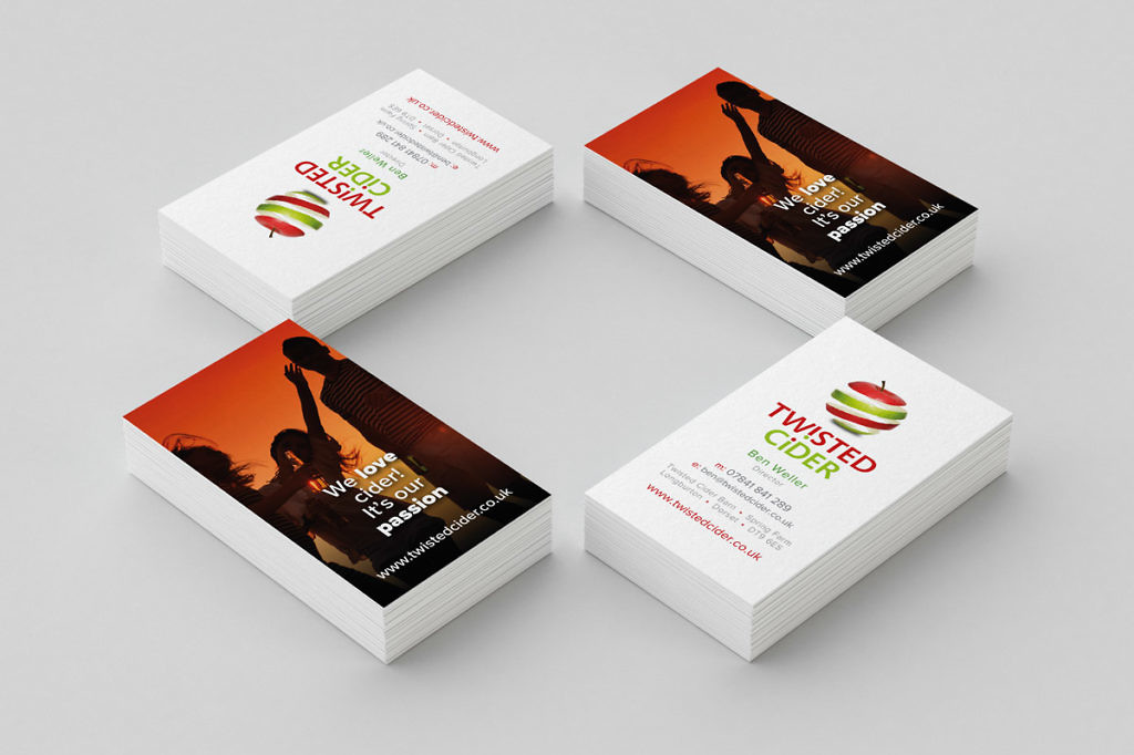
Our client Twisted Cider wanted a brand identity which made them stand out. Yes they are a premium craft cider, but they wanted to appeal to a young audience (or young at heart!), so no twee fonts or rustic looking designs for them.
The brand name drives the design which certainly helps the brand have a visible identity which stands out from the competition be it on a bottle label, a draught pull, advertising or through social media.
The feedback from customers is that it is memorable and easy to recognise in a busy shelf or bar front.
As the business has gone from strength to strength each year and the product has found homes on the shelves of a number of independent shops and free houses, so has the range of ciders grown.
Each new range has a new label design to support the main logo, representative of the taste.
Supporting imagery of people enjoying drinking Twisted Cider responsibly at social gatherings helps to shake off the image of traditional craft cider drinkers being a little stuffy.
