 [social_warfare]
 We first designed Carnation a website back in 2001 and updated it in 2006. Since then, styles have changed and best practices have developed with technology. The site was built before websites needed to be optimised across all platforms including phones, tablets and desktops. Due to this, Carnation decided it was time to revamp their website once again, helping to bring new accessibility to their products.
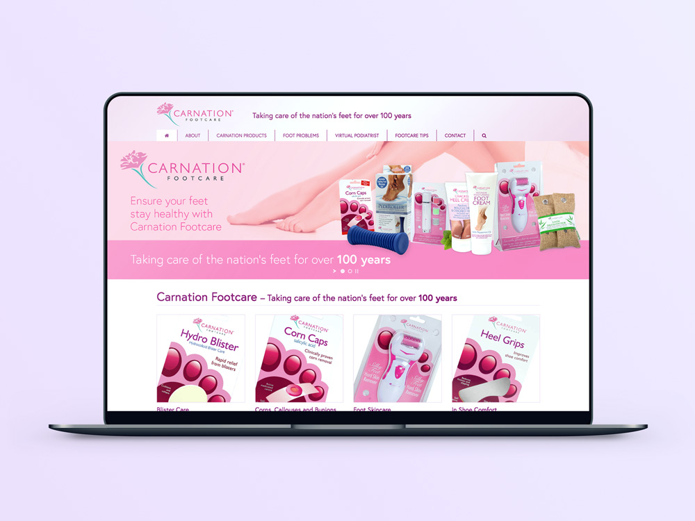
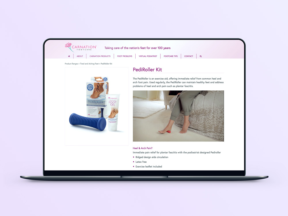
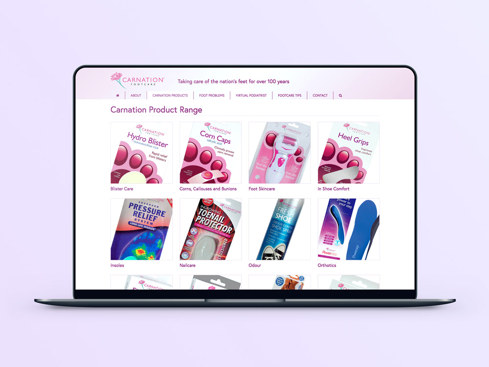
The new website uses a full-width homepage slider which cycles through the different Carnation ranges and products. Below the slider are the various Carnation categories such as ‘Blister Care’, ‘Corns, Callouses and Bunions’ etc. Each category contains the relevant products to alleviate the parent footcare problem. The product pages themselves list each aspect of the product, the benefits of using it and what the pack contains. The site also features pages such as ‘Foot Problems, ‘Virtual Podiatrist’ and ‘Footcare Tips’ which all help to hone down a potentially unidentified footcare issue, and link off to their corresponding Carnation solution.
See the new website for yourself here.
See other Carnation projects here.

