 [social_warfare]
 Antislip is a company that produce solutions for slippery and unsafe floors. They approached us to build them a new responsive website, which involved a complete update of their image. This included a new brand identity, which would match the new site.
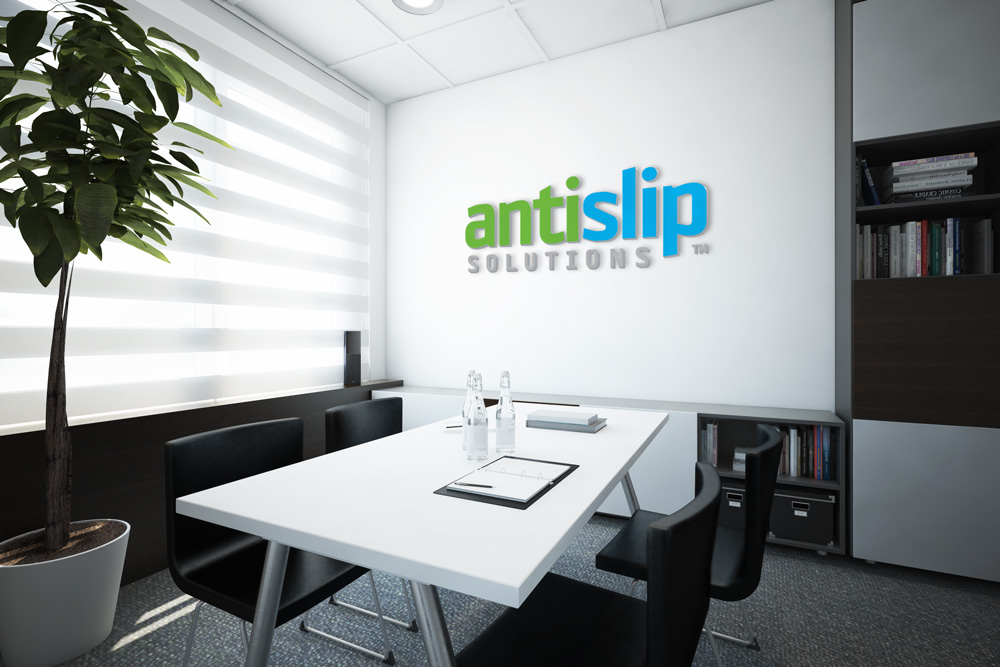
We used the old logo as a basic guideline so that the brand was developed rather than reinvented. We designed the green to be a lot stronger and have a more modern and clean vibe. We increased the size of “Solutions” so that it became more readable but changed the colour to a grey rather than the original black so that it didn’t draw the main attention of the logo.
The main typeface for the logo is a lot more modern and features straighter edges than the original, to reflect the firm surface concept behind their products.
You can find out more about Antislip on their new website.
Old Logo

Updated Logo
