 [social_warfare]
 Mailchimp rebrand review by Under Consideration.
‘Established in 2001, Mailchimp is a marketing platform for small businesses. Its core offering is one of the most popular email campaign and marketing delivery systems used by designers, non-designers, and pretty much everyone. There is no formal figure to be found, but their number of users is in the millions. Since its founding, they have now expanded into a “leading marketing platform for small businesses” (which, to be honest, I’m not sure what it means, but in principle it means that there is more to Mailchimp than email marketing). Yesterday, Mailchimp introduced a new identity designed by the San Francisco, CA, office of COLLINS and Mailchimp’s in-house design team.’
![]()
![]()
Collins project page:
“In partnership with the in-house Brand Team, we sought to capture and elevate the ineffable Mailchimp spirit, a potent combination of wry humor, modest celebration, and a dash of absurdity. We developed a new brand system that, in each element, works to maintain a precise balance between the sophisticated and the surreal (bucking reductive, over-simplified design trends), to better chart the company’s unique path and expression. The solution seeks to amplify Mailchimp as beacon for its customers, a message to growing brands that growing up doesn’t mean erasing your peculiarities.
The evolution retains all the elements that endeared the brand to its first fervent fans while creating space for Mailchimp to grow and speak with greater authority to a wider audience.”

Mailchimp Design Site:
“The Freddie icon has long been our brand’s primary mark. We’ve simplified it a bit, with tweaks to its shape and fine details to make sure it looks great at any size.
Previously, our beloved logo script and Freddie icon had hierarchy issues and never appeared together. This meant the icon wasn’t always recognizable on its own. Through a process of iteration and refinement, we’ve developed a wordmark that lives in harmony with the Freddie icon to build equity for both.”
Mailchimp Design Site:
“Cavendish Yellow is an energetic brand expression building recognition in moments when our voice must be clear and memorable. We anchor on a single color, used with purpose, to drive consistency across all properties.”

The new core typeface is Cooper Light, which is a fine choice. This does build on the rising trend of slightly ironic type choices in part made popular by the Chobani redesign. Going with a light serif does diverge a little, as the trend points towards bolder, sharper serifs.
Mailchimp Design Site:
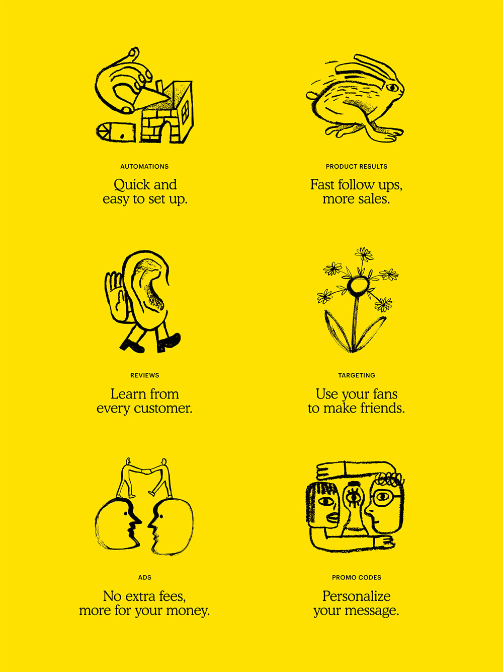
“Our new illustration style allows us to communicate about complex tools and marketing practices in a simpler and more human way.
To create the art for this system, we worked with a number of different illustrators around the world in addition to relying on our internal design team. By introducing a variety of artistic voices into our brand, we make room for a diversity of perspectives and visual styles.
Our new animation style is a natural extension of the illustration. We create a moving world where creatures, characters, and objects appear free but observed, and familiar but abstracted. We capture the key qualities of the illustrations through movement, and play with motion in unexpected ways. We also use animations to uncover or enhance moments of surprise found in the content.”

‘The illustrations are fun and weird, especially when they are animated. If you peruse the Mailchimp website sometimes they feel TOO weird and ambiguous. I also get a slight Dropbox illustration vibe, although these are all far more interesting. And weird. I’m not super crazy about the illustration-heavy approach but, on the other hand, I don’t know what else it could be.
‘One caveat on the redesign might be how much freedom they will now have in all their materials as, up until now, the Mailchimp in-house team has done some amazing, colorful, vibrant, weird, variedly-styled projects that this more defined style could potentially be limiting. (You can get a sense of what I’m talking about here). Overall, though, this is a fantastic update that maintains the weirdness of the company but delivers it in a new grown up style that feels authentic, unique, and bananas.’
What do people think?
Review by Under Consideration