![]()
Launched in 2007, Tumblr is a microblogging platform that allows users to quickly and efficiently post images, text, and video that, at the time, served as an alternate to the slightly more complex blogging platforms, WordPress and MovableType. During the late 2000s and early 2010s, it was one of the most prolific platforms for art, design, and pretty much every serialized musing imaginable, including gems like Garfield Minus Garfield as well as propagating many of the design trends of the time. Tumblr was purchased by Yahoo (now Oath) in 2013 and in recent years has lost some its traction to platforms on different mediums, including Medium, Giphy, Snapchat, and Instagram. Still, Tumblr is home to a cumulative 430.3 million blogs and 163.5 billion posts, making it a significant chunk of the internet — those numbers would be more interesting if they reflected activeblogs as people like me start and abandon blogs with reckless abandon. Perhaps the number of active blogs is significant enough for Tumblr to go through the extensive exercise of redesigning as it recently rolled out a new logo and identity designed in collaboration between Tumblr’s in-house design group and Basel, Switzerland-based Dinamo.
![]()
![]()
![]()
What Dinamo stated: “For the logo, the “t” and “r” characters were recut to stylistically align with defining attributes of the custom typeface. Other letters received more subtle updates; cleaning up overly nuanced attributes, and bringing a more architectural feel to the mark.
Optimizations such as the elimination of curved intersections, helped to optimize the logo for small screens without losing its essence. And most notably, we strategically removed the logo’s period, allowing the logo and typeface to seamlessly integrate across all naming conventions.”
“The before and after logos could be easily interchangeable and I don’t mean that in a dismissive or sarcastic way: it could easily be rationalized that the logo needed softer corners or hard corners, that tapered slabs are better than straight or that they are not, that it needed a ball terminal on its “r” or that it didn’t, that the period is great or it isn’t. Both are fine, both are acceptable solutions. Visually I like the new one better, it has a crisper appearance and the removal of the period makes the logo more open-ended; I never liked that the logo looked like a one-word sentence that started with lowercase. It now looks more mature as well and it pairs very well with the new type family.
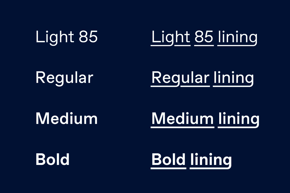
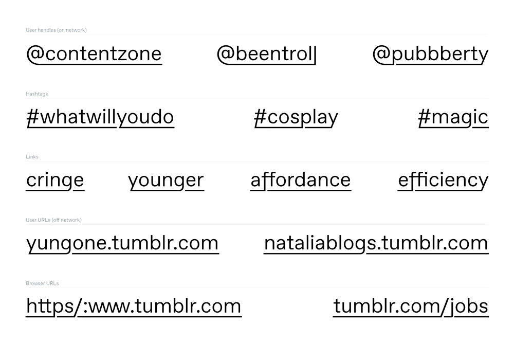
At the core of the reboot is a new type family that, at first glance (and, well, at second and third glances), is just another Humanist sans serif that looks like a dozen others. I’ll admit that there is something particularly nice about this one; it has some very pleasant proportions that were updated to work with those of the letterforms in the logo. What makes this typeface stand out from the overwhelming abundance of sans serifs in the world is the introduction of a “lining” style.
Overall, this redesign successfully positions Tumblr as a kind of fringe-yet-mainstream platform that celebrates what made it successful in the first place and what may keep it afloat against the competition.”
Article and analysis by underconsideration.com