Best Buy New Logo
“Established in 1983 (although dating back to 1966 when it was named Sound of Music) Best Buy is a retailer and provider of technology products, services, and solutions, with over 1,000 stores across the U.S., Canada, and Mexico. (In the U.S., they proudly state that “more than 70 percent of the population lives within 15 minutes of a Best Buy store” — I live 2 minutes away from one, FWIW.) Best Buy is one of the few brick and mortar chains that has managed to survive the Amazon retail takeover and managed to post revenue of more than $42 billion in fiscal 2018. Yesterday, Best Buy introduced a new logo. The press release hints it was designed in-house.”

Press Release from Best Buy
For the first time in almost three decades, we’ve updated our logo. It’s now more modern and easier to read, especially in today’s digital world.
“Best Buy” still appears in bold, black font, but now it resides outside of our signature yellow tag. The tag serves as graphic punctuation and a visual connection to our history.
![]()
Analysis from “Under Consideration”
The old logo wasn’t great or a bastion of fine design execution but it was impressively, undeniably effective as a storefront element, making their stores visible and distinguishable from a mile away, driving at 60 miles per hour on a highway. The yellow tag matched the price display in the store and the blue background was matched by the now-famous, now-almost-hip blue shirts of the employees. The logo wasn’t suave or cool or elegant, nope, it was dorky, uncool, and cheap-looking but it has gotten the job done for over 30 years — they even tried to replace it in 2008 but it didn’t take.
The new logo is technically and aesthetically better, with more balanced letterforms — the type in the old logo may have been scaled horizontally — brighter colors, and an overall more refined look. I think they did a good job with the placement of the yellow tag, tucking it under the “Y” with the hole of the tag working almost like a period. (I don’t know why the hole ain’t a hole, though.) The spacing in the type is troublesome because it’s an unfortunate combination of nightmare-kerning-pairs and when set so tightly all the awkwardness is more evident and I wonder if the leading should be as tight as the letterspacing to create a more cohesive unit.
The biggest challenge this logo has, though, is the amount of time it will take for all those storefronts to change — and what are they going to change to? — as it will require a huge capital investment to update the most effective beacon of the brand.
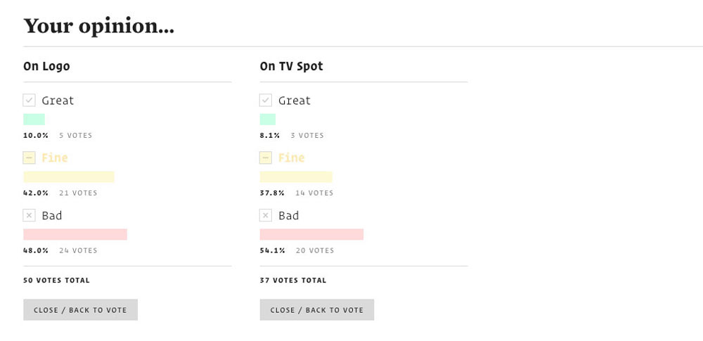
What do people think?
Credit to underconsideration.com