 [social_warfare]
 Designer Challenges Himself To Create A Typographic Logo Every Day For A Year, And They’re Pretty Cool
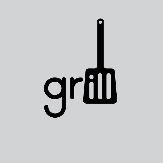
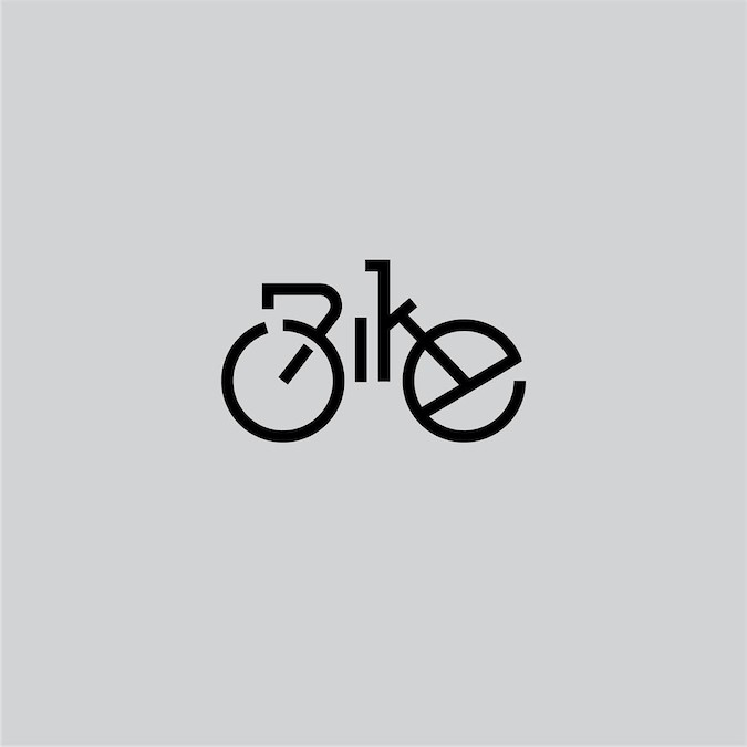
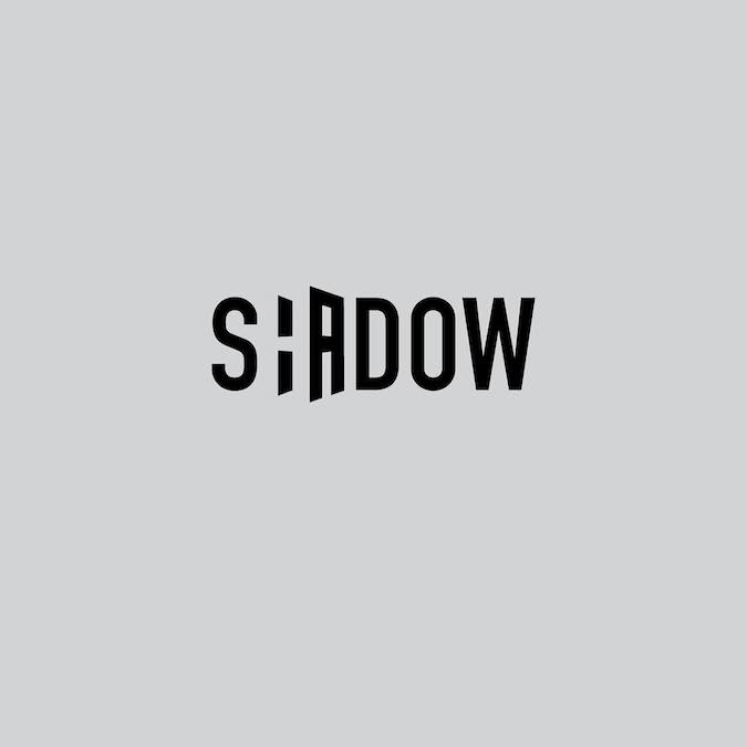
Stockholm-based graphic designer Daniel Carlmatz undertook a 365-day challenge to create one new typographic logo of a common word we use every day. The objective was to visualize the meaning of the words by using symbolism, negative space, or by adding geometric elements to the letters. For example, the letter ‘a’ in the word ‘search’ looks like a search bar, the letter ‘j’ in ‘jazz’ looks like a saxophone, and so on.


See more from this project here.