Close Menu
  •  Home
  •  our services
    •  website design
    •  search engine
      optimisation (seo)
    •  social media
      marketing
    •  branding design
    •  packaging design
    •  advertising
  • our work
  •  blog
  • about us
  •  contact us

07885 552888

info@zigzagmarketing.co.uk

  •  Home
  •  our services
    •  website design
    •  search engine
      optimisation (seo)
    •  social media
      marketing
    •  branding design
    •  packaging design
    •  advertising
  • our work
  •  blog
  • about us
  •  contact us

Analysis: New Logo for HSBC

Posted on 20th April 2018 by mitch
HSBC [social_warfare]

New Logo for HSBC

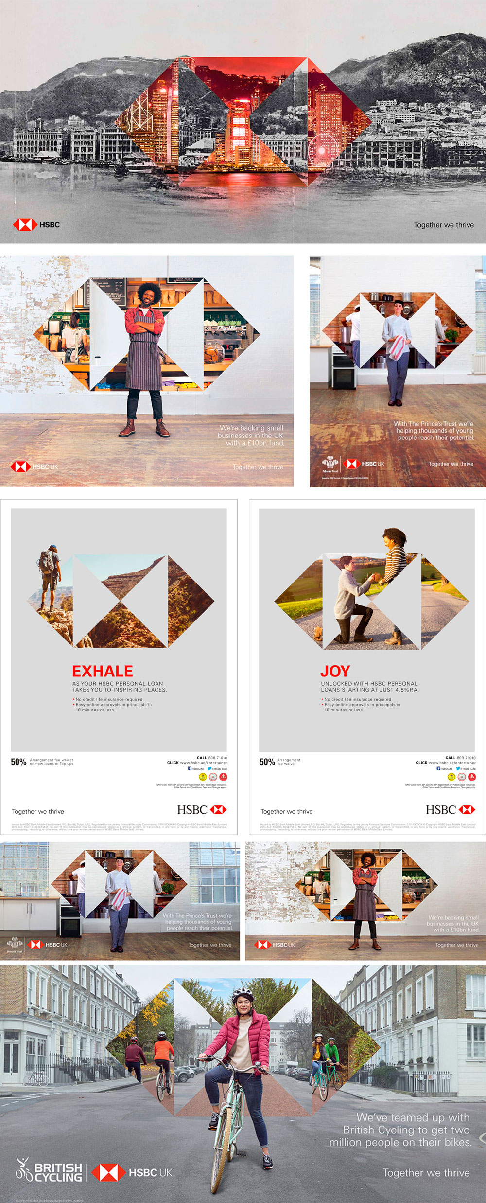
(Est. 1865) “HSBC is one of the world’s largest banking and financial services organisations. We serve around 38 million customers through four global businesses. Our network covers 67 countries and territories in Europe, Asia, the Middle East and North Africa, North America and Latin America. With around 3,900 offices worldwide, we aim to be where the growth is, connecting customers to opportunities, enabling businesses to thrive and economies to prosper, and ultimately helping people to fulfil their hopes and realise their ambitions. HSBC is listed on the London, Hong Kong, New York, Paris and Bermuda stock exchanges.” HSBC has changed its logo — keeping the recognisable hexagon icon — from a serif on the left to a sans serif on the right while modifying the size relationship between the elements.


Opinion from ‘Brand New’

“Better? Worse? Does it make a difference? I didn’t care much for the old serif wordmark but I didn’t dislike it either so I’m not outraged or delighted for it to change. It’s weird though that they made a 180-degree change and settled on a fairly insipid sans serif — I mean, I understand it’s one of the largest financial institutions in the world so it’s not going to be a party but even then this is as dry as it gets. It’s hard to tell from all the versions that exist online but I also think the red is purposefully darker than before. The only mention of the brand changing is about the campaign but there is not much else out there — I do like the different ways they are using the icon in the ads. Overall, yeah, it changed from one acceptable solution to another.”


Credit to: Brand New

Read more about this logo analysis.

Archives

  • March 2019
  • February 2019
  • January 2019
  • December 2018
  • November 2018
  • October 2018
  • September 2018
  • August 2018
  • July 2018
  • June 2018
  • May 2018
  • April 2018
  • March 2018
  • February 2018
  • November 2017
  • January 2017
  • December 2016
  • November 2016
  • October 2016
  • July 2016
  • June 2016
  • April 2016
  • February 2016
  • January 2016
  • December 2015
  • November 2015
  • October 2015
  • September 2015
  • August 2015
  • July 2015
  • May 2015
  • April 2015
  • December 2014
  • October 2014
  • September 2014
  • July 2014
  • June 2014
  • April 2014
  • January 2014
  • November 2013
  • October 2013
  • September 2013
  • August 2013
  • August 2012
  • February 2012
  • November 2011
  • October 2011
  • August 2011
  • July 2011
  • June 2011
  • May 2011
  • April 2011
  • December 2010
  • November 2010
  • October 2010
  • April 2010
  • January 2010
  • July 2009
  • April 2009
  • March 2009
  • February 2009

Categories

  • 3D
  • Advertising
  • Animated
  • Branding
  • Designs We Love
  • Email Marketing
  • Graphic Design
  • Infographic
  • Marketing Comms
  • Packaging Design
  • Print Design
  • Social Media
  • Typography
  • Uncategorised
  • Website Design
  • Zig Zag News

zig zag marketing.

  • 19 Grundys Lane
  • Malvern
  • Worcestershire
  • WR14 4HS
  • 07885 552888
  • info@zigzagmarketing.co.uk
  • © 2025 zig zag marketing
  • privacy policy
  • terms & conditions
  • website by zig zag

take a closer look at your marketing... take a closer look at zig zag