 [social_warfare]
 Feel like you!
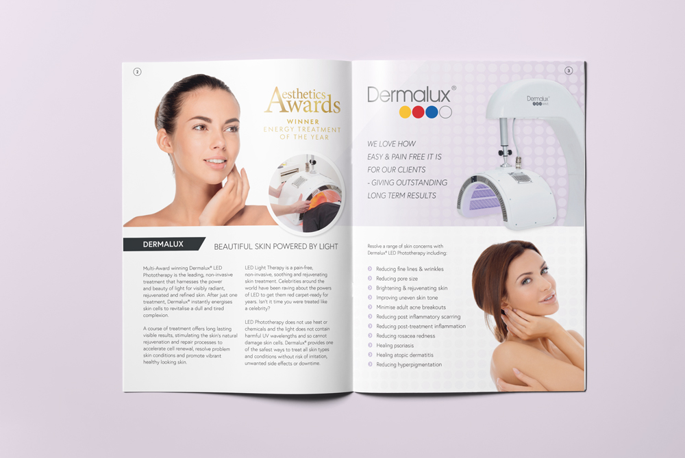
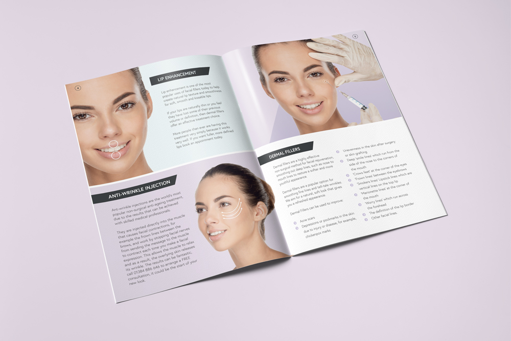
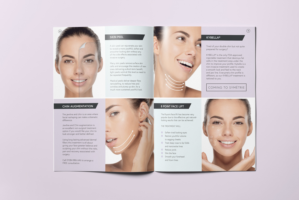
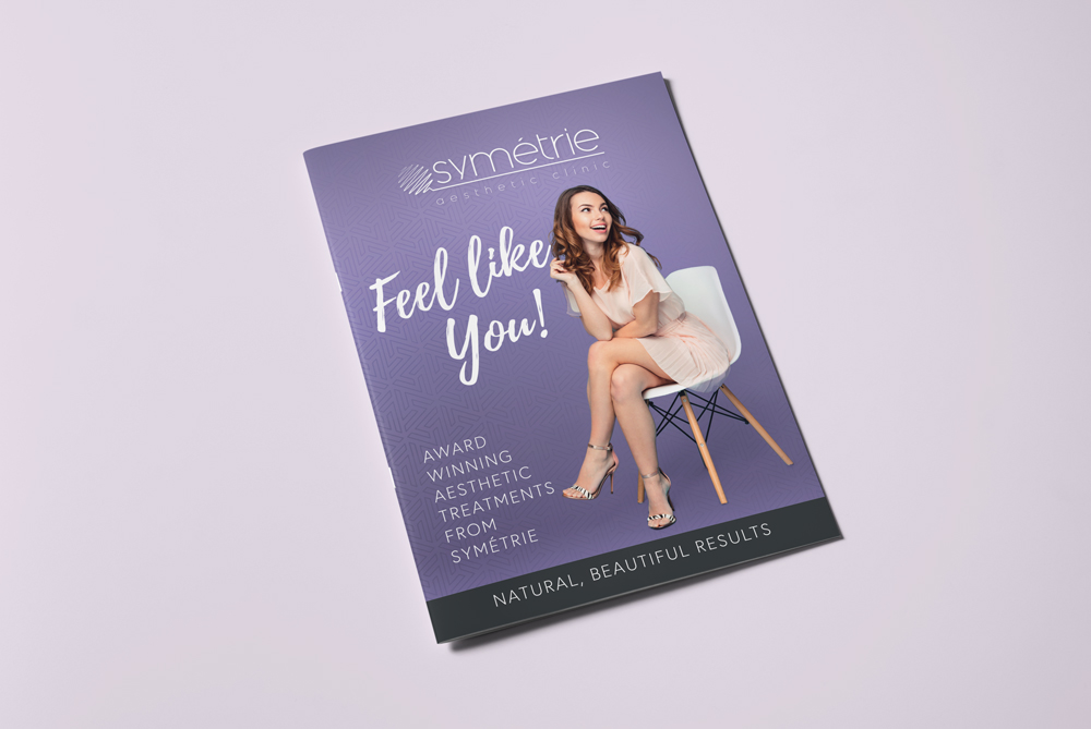
Symétrie approached us to put together an A5 booklet, which would showcase what they offer, from treatments to cosmetic products. The booklet uses the same colour scheme as their new website and uses the same bold, illustrative images for each treatment. The treatments were allocated page-space based on their popularity and amount of information and cosmetic benefits.
The front cover of the booklet was designed to feel clean and reflect the style of the Symétrie branding, using the brand purple and black, combined with a subtle background pattern. We used a lifestyle shot of the same model that features throughout Symétrie’s branding.
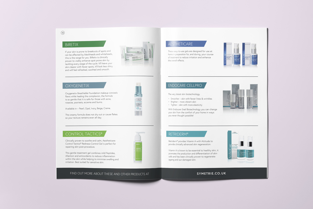
The booklet also features current offers as well a range of products, each with a brief description of the brand and it’s benefits.
You can find out more about Symétrie on their new website.
