 [social_warfare]
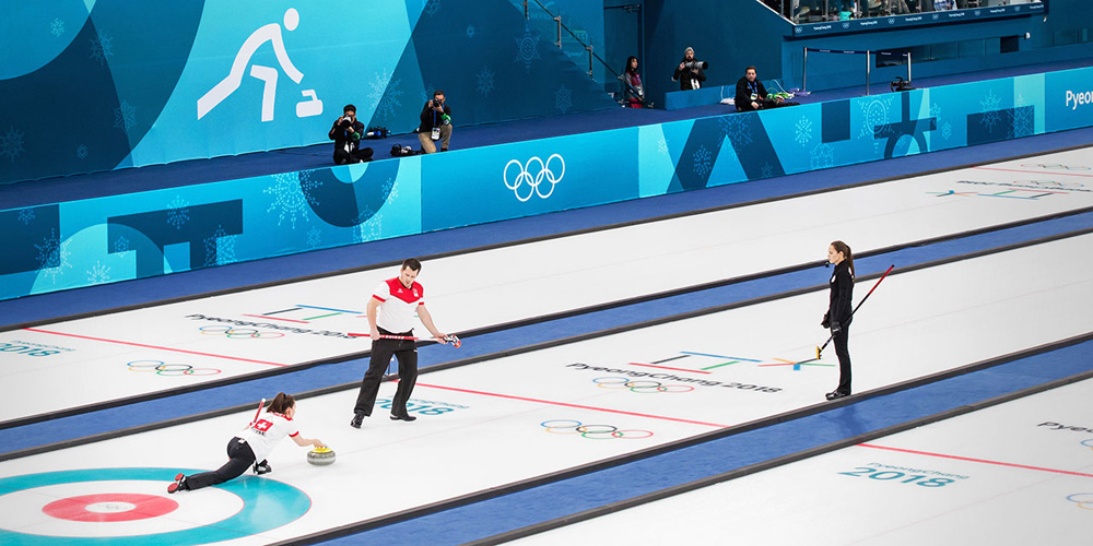
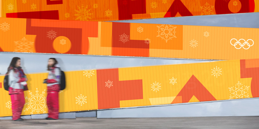
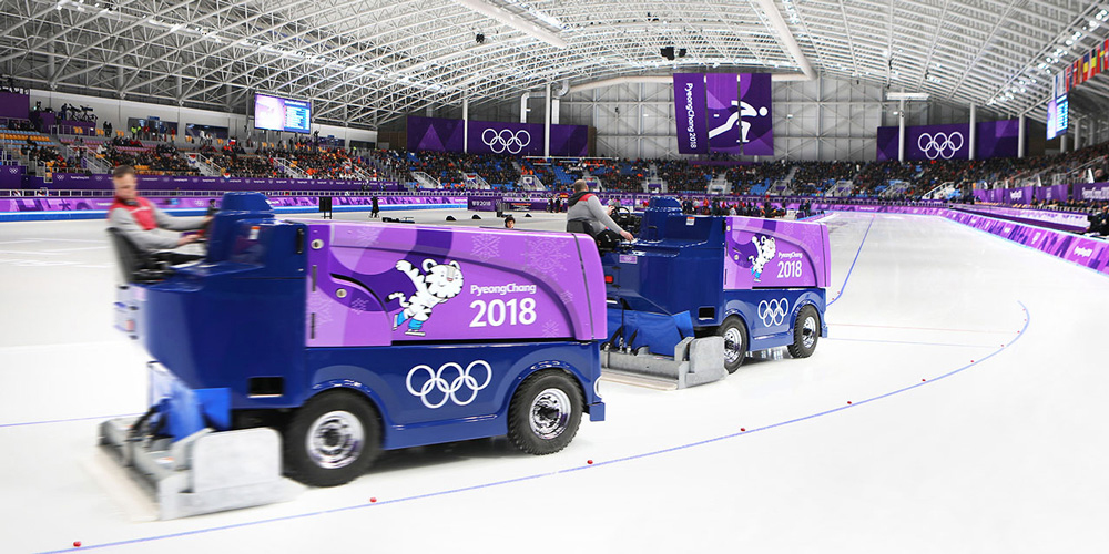
 Needing little explanation since you are probably watching it right now, the XXIII Olympic Winter Games have been held for nearly two weeks, ending this Sunday, in PyeongChang, Gangwon Province, the Republic of Korea. In the background of all the action is the Look of the Games, which was designed by the Seoul office of Interbrand.

“Elements of [the Hangul alphabet, which was created in the 15th century by Sejong the Great to promote widespread literacy] are woven throughout the identity, drawing on Korean national heritage to tell a unifying—and igniting—story. A historical study of Hangul typography informed geometric designs that contain keywords representing the harmony of audiences and athletes at the games. Shapes and colors created by the overlap of letters signify the interplay of cultures, and the opening up of new possibilities. Implicit in all this is the “Passion.Connected.” tagline, created to convey the spirit shared by all those connected to the Games.”


Source: underconsideration.com