 [social_warfare]
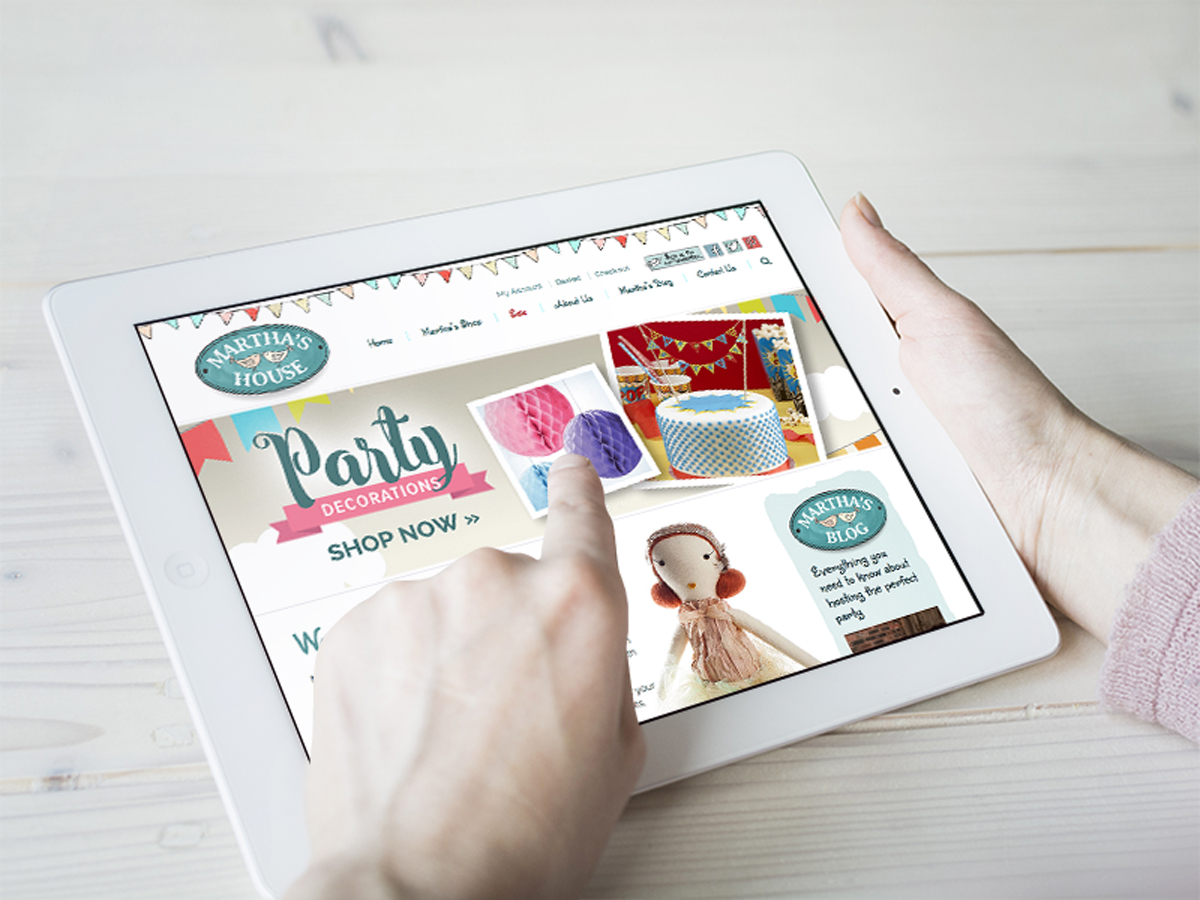
 Martha’s House came to us because they had a website but it just wasn’t working out that great for them, although it had nice creative artwork the way that the website had been built was causing issues and importantly it was proving hard to shop on. We suggested adapting the design to one which provides a better user experience for shoppers, enabling them to find the product they are after faster and browse the other products more effectively. Just like all the websites that we build it is fully responsive for visitors viewing on a mobile device. We recommend checking them out if you are planning a party or if you want to have a look at an e-commerce website that is a little different.